Frontlit vs Backlit vs Full-Lit Letters
Three constructions, three personalities. This comparison explains how each letter type is built and reads, so you can specify the glow your building actually needs.
Every illuminated letter in the catalogue is one of three constructions, and the choice between them is the most consequential decision in a letter order — more than the font, more than the finish. The three differ in where the light lives: in the face (frontlit), behind the letter (backlit), or throughout the letter's body (full-lit). They read differently by day, by night and in photographs, they suit different buildings, and they are not interchangeable parts of one product. This guide compares them properly.
Frontlit: the Face Glows
A frontlit letter is a fabricated shell — metal or formed returns and back — closed by a translucent acrylic face, 3, 5 or 8 mm in the listed options, lit from inside by waterproof LED modules. The face is the light. Frontlit letters deliver the strongest direct read at the greatest distance, carry brand color in the face itself, and are the standard for retail names that must work as pure communication. By day the colored acrylic face still reads clearly; by night it is the brightest object on the facade. Choose frontlit when the sign's job is to be read — by traffic, across a car park, down a high street.
Backlit: the Halo Glows
A backlit letter has a solid face — brushed, polished or painted stainless steel — and its LEDs fire backwards at the wall. The letter reads as a precise metal silhouette inside a soft ring of light, the halo, whose width is set by the standoff gap. Nothing about it shouts; everything about it costs money and looks like it. Hotels, law firms, clinics and premium retail choose backlit because the effect is architectural rather than advertising. By day it is simply beautiful metal lettering. Its limits: on glass or mirror-polished walls the halo can glare, and at very long distances a glowing face out-reads a halo.
Full-Lit: the Whole Letter Glows
A full-lit letter is formed from translucent acrylic throughout — face and returns — so the letter glows as a volume, edges and all. It is the closest relative of neon in the letter family: soft, rounded, friendly, and strongest in playful and food-and-drink settings, children's and creative brands, and interiors where the letter is seen up close. The color lives in the acrylic itself, so the palette is wide and saturated. For very large letters, metal constructions scale further; at small and medium sizes, full-lit is often the warmest result per dollar.
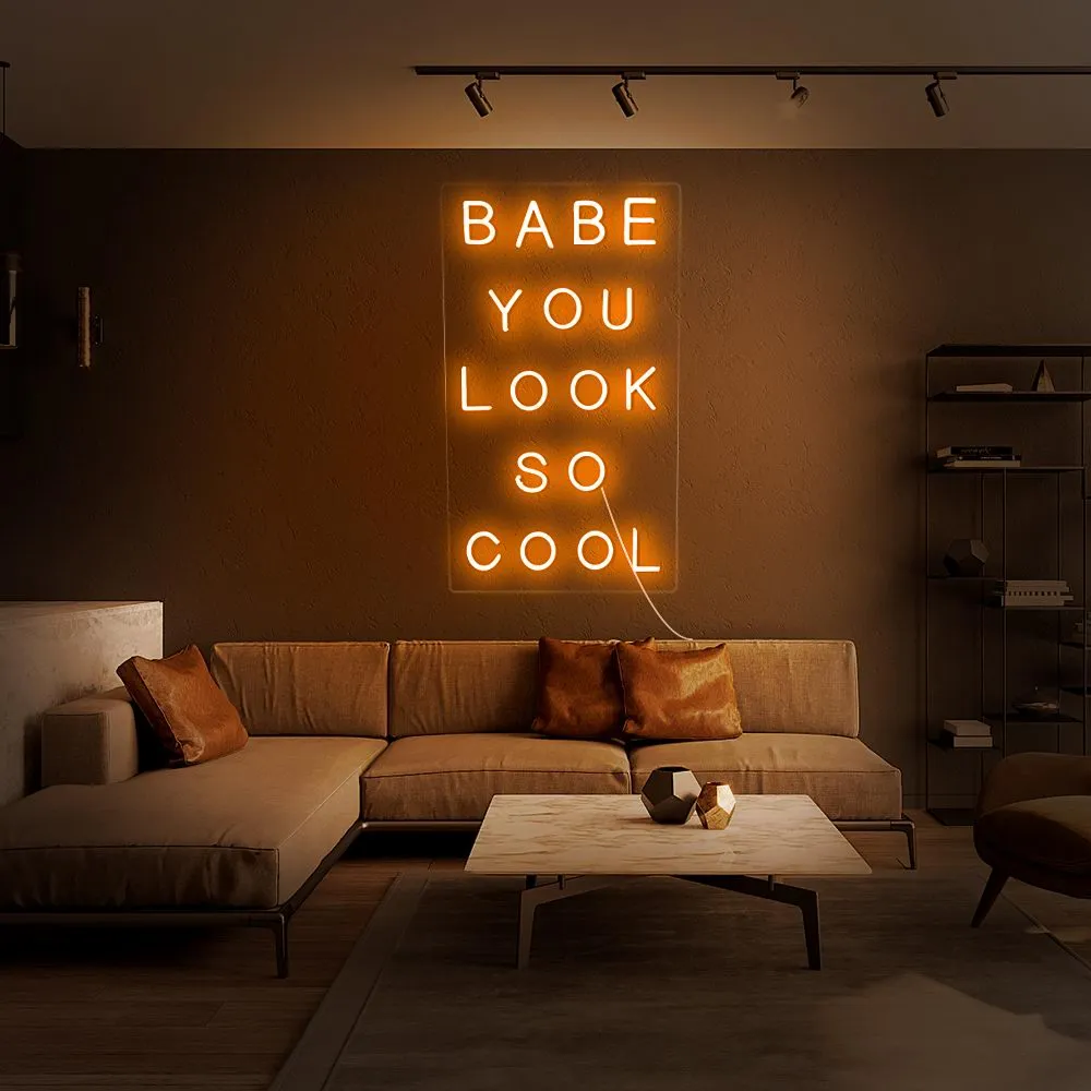
And the Fourth Option: Both
Front-and-back lit letters run the two paths together — glowing face, glowing halo — on one or two circuits. They are the flagship construction: maximum presence, maximum flexibility (dim the halo after hours, keep the face), and the highest price of the four. For a headquarters entrance or a flagship store, the combination earns its premium; for a standard unit sign, it is usually more letter than the job requires.
A Decision Shortcut
Must be read from far away? Frontlit. Must look expensive up close? Backlit. Must feel warm and playful? Full-lit. Must do everything, once, at the flagship? Front-and-back. Then let the proof arbitrate: the letter pages' shared specification — #304/#316 steel, 3/5/8 mm acrylic, Mean Well transformers, DC 12V, 1:1 installation template, listed 5-year warranty on steel and acrylic elements and 3 years on LED and transformer — applies across constructions, so the comparison is honestly about light, not about hidden quality tiers.
What the Proof Should Show Before You Choose
Because the three constructions photograph differently from how they stand in a room, insist that the proof stage argues the choice visually. Ask for your name rendered at the ordered size in the shortlisted constructions, on a photograph of your actual wall, in a day view and a night view. Frontlit will win the night view on legibility; backlit will win it on atmosphere; full-lit will win on warmth. Then walk the wall's real distances: read the day view from where a driver reads, the night view from where a pedestrian decides. The construction that wins at your distances, in your light, is the right one — and if the quote proposes a different construction from the one the proofs favor, the sentence explaining why is the most valuable line in the whole order. A maker who can defend the choice in one sentence understands your building; a maker who cannot is selling stock.
Whichever construction wins, record the decision and its reason with the order paperwork. Buildings change hands and signs get re-ordered years later; the note that says why this letter glows this way is the difference between a faithful replacement and a fresh argument.
Связанные страницы
Связаться с фабрикой
Есть идея вывески? Отправьте текст, файл логотипа или фото стены, и мы ответим макетом-дизайном и коммерческим предложением.